Salesforce Obscura: Nonprofit Data Pipeline On the Cheap (Part 2): The Ecosystem
This article is the only one in the series that is largely conceptual and focuses on framing up the solutions. It’s also part of our data literacy project as it talks about the different types of reporting and how to think about reporting ecosystems.
I don’t ever like to introduce tools without talking about when you should (and shouldn’t) consider them and framing up why we make the decisions we make at Deep Why.
So if you’re not a technical person, but are instead looking to understand more about reports in a Salesforce ecosystem, read on!
Buckets of Reporting
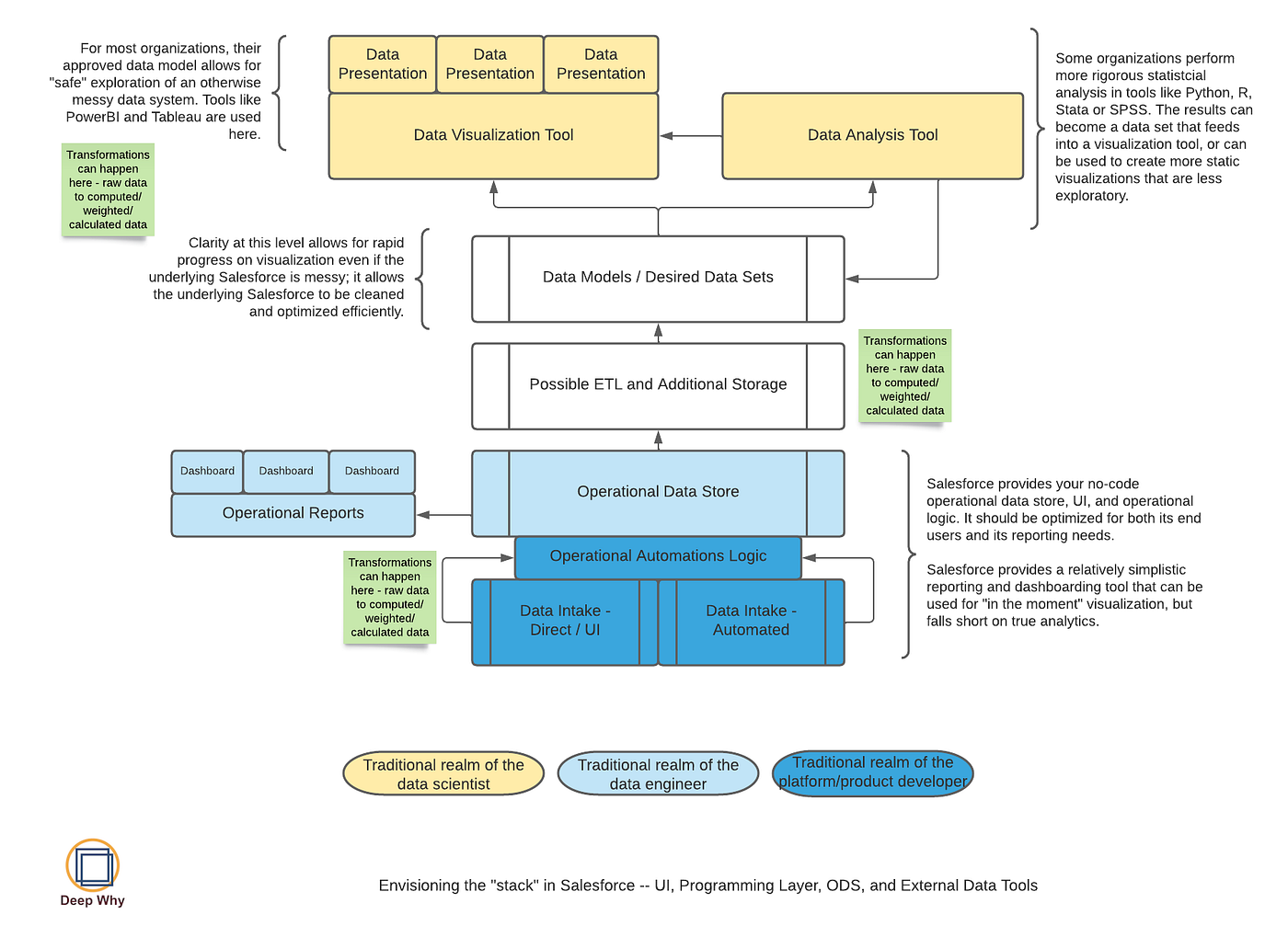
Many organizations who use Salesforce rely solely on the reporting and dashboarding tools that come with it, and those tools can take you a really long way. A skilled admin or architect also understands the interventions that let you go even further with Salesforce reports (see “when do you look beyond Salesforce” below for examples).
But at some point, if you’ve gotten so many Flows or triggers or other automations to move data around and optimize for reporting and you still can’t get the reports you need, your organization may have outgrown the native tools, powerful as they are.
When we’re working with clients on data and reporting needs, we try to frame our questions by breaking reporting down into 4 big buckets, being very clear about which bucket a request falls into, and being very strict about the processes that can impact those buckets.
We love Salesforce because it’s fast and responsive and nonprofits live in a world that is impossibly demanding of rapid change. Sometimes, with data, you need to be able to respond quickly. But you also need to be very clear when a fast change is not appropriate or is outright harmful. Framing your questions within the buckets helps an organization shift out of data confusion and into a more useful enterprise data mindset.
Report Bucket 1: Operational or Transactional Reports

Operational (or Transactional) reports are typically “how many / how much” and “right now” type reports that show things like “how much money have we raised this year so far” or “how many participants are on each person’s case load right now.”
These belong as close to your operational data solution (Salesforce) as possible, and typically are very well supported within Salesforce. It’s an immediate response to data someone is keying in in real time.
In the diagram above, they’re in blue. And they’re usually created and managed by end users, Salesforce data users, or Salesforce systems administrators.
Report Bucket 2: Managerial or Performance Monitoring Reports

Managerial (or performance monitoring) reports are typically KPI-style reports that grow out of operational data and help managers keep an eye on things. They are answering questions like “are we on track to raise what we’re supposed to” and “are all of my staff doing what they’re supposed to do with our participants.”
For example, if your program helps people obtain stable housing, and you know that there are typically 10–15 interactions with the housing agency required for this to occur, a managerial or performance report might:
- look at how many interactions a caseworker has had on behalf of a participant, or
- ask how many participants have fewer than 10 interactions after 2 months in the program.
In the diagram above, these reports may live in Salesforce (blue) or they may be incorporated into more structured data visualizations (yellow). Depending on which area they come from, they may be managed by Salesforce administrators or by a data and analysis role.
Report Bucket 3: Outcomes Reports

Outcomes are typically end of year, “look back” type reports. These are the things you report to funders and use to look across your organization’s performance year on year. They are aligned to your logic model and theory of change.
They are typically carefully defined and curated and often relatively slow to produce. They usually require a lot of processing to turn “how many/how much” data into real indicators of impact. They are often some of the oldest reports in an organization.
A change to outcomes reporting ripples throughout an entire organization and should involve many people. Most organizations’ activities are aligned around their outcomes reporting, so changing an outcome means you have to assess what front-line staff are doing, what needs to change for the new outcome to be reportable, what needs to change for training and management, and so on. It is and should be a Very Big Deal.
Outcomes reporting typically resides in the analytics (yellow) part of the diagram above and is often at least one step removed from living Salesforce data.
Report Bucket 4: Predictive or Leading Indicator Reporting

Predictive reports are computations that run against real-time or near-real-time data to help you see if you’re on track for your outcomes or not.
An outcome might be “ensured 60% of our clients moved from unstable to stable housing in a year.” The operational data that drives the outcome might simply be a couple of fields that are “started the year in unstable housing” and “ended the year in stable housing.”
But you don’t know until the end of the year how you did, and that’s way too late. Some organizations can use their managerial reporting to keep an eye on what they might expect in outcomes. Others want to incorporate statistical analysis and, increasingly, AI to comb through every data element they capture for patterns that humans may overlook.
This work lives very firmly in the Analysis (yellow) part of the diagram and is owned by people who really understand data analysis and data modeling, statistical validity, and other mathematical pieces and parts that require a lot of infrastructure before their work can begin.
Most of the organizations I work with don’t get into predictive analysis simply due to cost and complexity. Part of the reason I am writing this series is to try to find ways to reduce reporting infrastructure costs and burdens so that organizations can spend more time making meaning out of data and less time fighting inefficient tools that get in the way of meaning making.
What’s with the “ETL” and “Data Model” part of this diagram?

A data model is nothing more than the way the data fits together so that it can be analyzed correctly. Your transactional data store might have the data spread across many different objects (tables) — think about it like lots of different tabs in a spreadsheet.
When you want to analyze it, you need to understand how all those pieces fit together. Sometimes you need to change it from one format to another — to “flatten” it (for example) so that you have one row per person with many columns representing activities. That has to be done with programming or in a query language like SQL. Data visualization tools also have a range of ways to construct a data model that can be used for dashboards and reports.
The data as presented in a structure optimized for your visualizations is a data set. This might be the one spreadsheet tab that you’ve created by combining all the others so that you can pivot it how you want. Or it might be a database table or view or any number of other things.
ETL means “Extract / Transform / Load.” Whenever you have to move data around between systems, you’re doing a type of ETL. Even downloading a csv (“extract”) and manipulating it in Excel (“transform”) can fit this pattern.
“Possible Additional Storage” — sometimes you don’t need anything other than Salesforce, but sometimes there’s value in having another system that operates differently than Salesforce and provides the structures available in a SQL database or some other data storage approach.
In this series of articles, we are using Azure SQL Server as the additional storage and Skyvia as the ETL.
When do you look beyond Salesforce reports and dashboards?
Every organization is different on this answer. For some, the answer is “never.” For some, it’s “immediately.” Frankly most just don’t know.
Because we work with small and midsized nonprofits, our rule is: only after you’ve exhausted every other reasonable approach and can articulate needs that clearly would incur massive technical debt inside of Salesforce to accommodate.
If you have Salesforce you hopefully have a Salesforce admin, so wherever possible we try to keep solutions within the skillset of that admin. Moving into the kinds of analysis and reporting structure we’re talking about in this series means adding yet another ongoing expense, a governance and change management requirement, and a need for new skillsets. That’s worth it when you really need that infrastructure, but is just an added strain until you do.
What does “exhausting every other reasonable approach” look like?
Salesforce gives you a very powerful toolkit. Be warned — there’s a fine line between exhausting all approaches and amassing technical debt. We still err on the side of starting with approaches familiar to Salesforce administrators. This allows you to onboard a new admin or consultant more easily than when you move into a more complex environment.
(1) Making full use of the architectural tools
- Aggregating data from child to parent objects using rollups or DLRS
- Cross-linking objects — for example, if you have a Contact object with many Interventions but you only ever need to report on the most recent Intervention, you would add a lookup on Contact to Intervention (called “Most Recent Intervention” most likely), set up a Flow to populate that field, and voila, you have access to the data you need.
- Making thoughtful and thorough use of report types and fields linked via lookups. For example, needing a “flatter” view from an object two or three levels deep in the architecture, you might build a custom report type that shows only one row per your child object with all the fields from its parent objects.
(2) Making full use of Salesforce automation tools
- Remembering that reporting snapshots are super useful in the right circumstances. Are you struggling to answer stuff that is a “point in time” question — like, at this time last month what did our active enrollments look like compared to today? You can use reporting snapshots to help answer that.
- Using Flows to move data around for better reporting. Just because it’s easier for your users to store data in one way doesn’t mean you’re stuck with that data structure for reporting — could a Flow help you move data behind the scenes to make a better report?
- Assessing if another Salesforce-native tool answers the questions you’re asking. Apsona is frequently used as the “next step” reporting tool, for example, and it and similar tools should not be discounted if they can solve the problem. Total cost of ownership can and should be compared between Salesforce-native tools and the approach documented in this series.
(3) Looking to process and partnership before technology
- Think critically in partnership with the requesting user about reporting requests. As technologists, we’re inclined to solve problems with technology. Partnering with users to really investigate what they’re trying to solve may help you point out better and more useful ways of answering the question.
What might some unsolvable problems look like?
Some examples of things I’ve run into as a Salesforce solutions architect and someone with an extensive SQL / database background. Your mileage may vary.
(1) The Dreaded Hinge

Providing meaningful reporting on two or more peer objects that are related through a single, shared parent in some many-to-many fashion. The architecture is in the shape of a door hinge, with the parent object being the key piece holding the other pieces together. I hate this problem so much I named it “the dreaded hinge.”
If you don’t need data off of both objects, and can roll up a count from one object to the parent, you can answer these questions in Salesforce. Otherwise, not so much.
When rollups and cross filtering fail, it’s the Dreaded Hinge problem.
(2) Show me ONLY the people who have (count/sum) for (arbitrary thing)
Everybody wants to do things like sum(amount) and then filter on the sum. Show me ONLY everybody who has donated more than $500 in some arbitrary time period not already summarized by the NPSP. Show me ONLY people who have 3 or more registrations for this one summer camp.
For folks who expect to be able to do any arbitrary analysis on known data points, this just doesn’t work.
In SQL or a programming langauge this is another trivial problem to solve. But you’d have to resort to programming to get that answer in Salesforce, which doesn’t result in what people need or want for many types of questions they need to ask.
(3) Anything that requires using the results of complex architecture mapping, basically
In Salesforce reporting tools, you can use all the architectural, automation and report type tricks to emulate a lot of stuff you’d have in a SQL engine, but you are never actually accessing the same concept as when you express, in SQL:
select a.field1, b.field2, c.field3
from a
left join b on a.id = b.id
left join c on a.id = c.id
where a.Id in (select d.id from d where d.startDate > today)
To truly do this in Salesforce, you would have to write an Apex script. You would first select what you want from object a and store it in a list; then in object b and store that in another list; then in object c into a final list. Then you would create a map to show the outputs you want, and iterate through your lists programmatically to identify which records belong in your map. Then you would do whatever it is you’re going to do with your map.
So while you can mimic many things a SQL database might do, the underlying translation that is happening in SQL (or that you engage with directly as a programmer) is not something Salesforce provides you in its native reporting toolkit. So sometimes, you just have problems you can’t solve, or you can only sort-of solve them in ways that require further processing.
(4) You need to combine data from many data sources
Not unsolvable in Salesforce, but many times it’s just easier to use the right tool for the job. Old school data warehouses and all of their successors all boil down to putting a bunch of unrelated stuff in the same place where it’s easy to link it all together to make meaning out of it. And SQL provides things like views and stored procedures that let you transform that data a lot more easily than having to do it all in Salesforce.
OK, we really do need SQL too. What’s next?
In the next article we’re going to shift away from the conceptual and into step-by-step guides. It definitely helps if you have some Azure or SQL experience but it isn’t necessary. You do need to be in a technical role in your organization to do the next steps.
First we set up the Azure environment that will become the data warehouse, then we use SkyVia to transfer data every day into the Azure environment, and finally we talk a bit about transforming data inside of SQL to create the “data set” part of the diagram that ultimately feeds into powerful visualizations.
What’s in this series?
You should read these in the order listed below.
- Overview — introduces the series and outlines our example use case
- Salesforce and the data visualization ecosystem — this article, which explores the more conceptual aspects of data and reporting
- Setting up SQLServer as a Data Warehouse — the steps to set up SQLServer in an Azure environment to meet the requirements of being “good enough” for this use case
- Setting up SkyVia to replicate your Salesforce data into SQLServer — the steps to use SkyVia to pull data from Salesforce into SQLServer on a regular basis
- Transforming data inside your SQLServer for visualization — the overview of why you’d have data in SQLServer in the first place, what your automation options are, and how you might use this thinking to support visualizations
FAIR WARNING: YOU GET WHAT YOU PAY FOR WHENEVER DATA IS CONCERNED. Analysis on the cheap is going to be bad analysis and the more powerful the toolkits the more that can go wrong. I am focusing only on building an affordable data pipeline and storage solution, which are things that are likely in reach for a sufficiently technical Salesforce administrator.
If you read this series and feel despair at executing on this stuff yourself, reach out. We at Deep Why focus on making your Salesforce ecosystem work really well, which can include getting it into an Azure data warehouse. Our friends at Inciter specialize in helping you understand your data and making all of your reporting needs seamless and easy. We often work together, so if you’re not sure just shout and we’ll get you to the right team.
